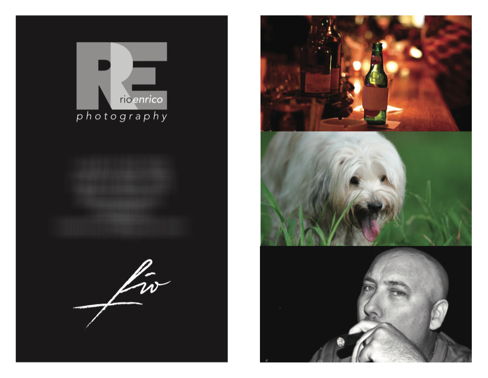
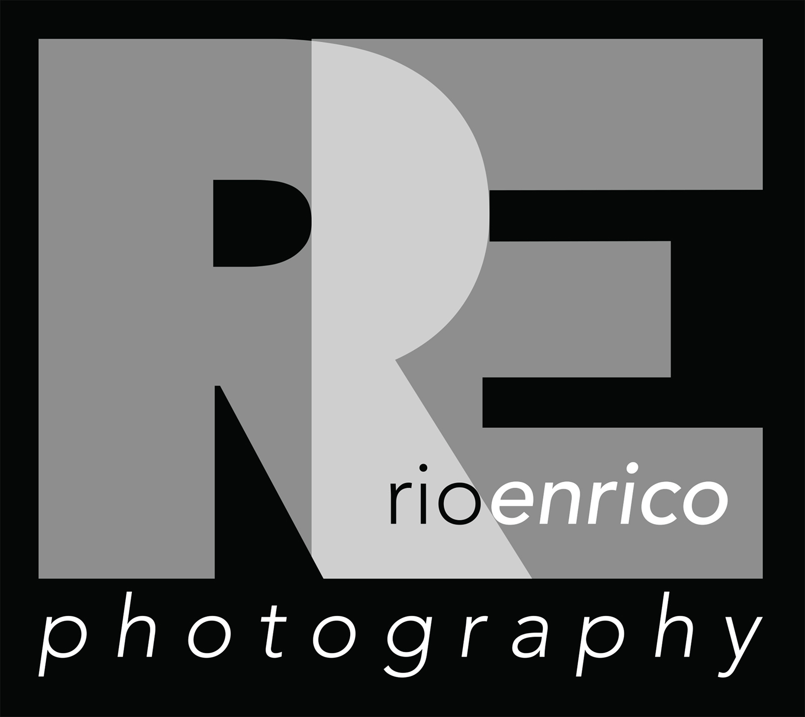
Rio Enrico Brand & Marketing Kits
The branding project for Rio Enrico focuses on establishing a sophisticated and modern visual identity that reflects professionalism and creative expertise. The design utilizes a minimalist approach, centering on a clean typographic logo that balances contemporary aesthetics with timeless appeal. By employing a monochromatic color palette primarily deep blacks and crisp whites the brand kit communicates a sense of luxury, clarity, and authority, ensuring that Rio Enrico stands out in a competitive market while maintaining an air of understated elegance.
Design is the silent ambassador of your brand, where simplicity meets a powerful statement.
The comprehensive marketing kit includes meticulously designed business cards and stationery that prioritize functional layout without sacrificing style. The business card design features a dual-tone concept, where bold black backgrounds contrast with white text to create a high-impact visual experience. Every element, from the choice of sans-serif fonts to the strategic use of white space, is engineered to facilitate easy reading and leave a lasting impression of quality and attention to detail during professional networking.
Beyond the physical assets, this branding strategy aims to create a cohesive narrative across all marketing touchpoints. The “RE” monogram serves as a versatile signature, adaptable for digital platforms, social media, and physical collateral. This consistency ensures that the Rio Enrico brand remains recognizable and trustworthy, effectively bridging the gap between artistic vision and commercial viability. The final result is a brand identity that is not just a logo, but a complete visual language that speaks of excellence and strategic creative thinking.